
Libby
ROLE
Product Design
DURATION
April 2025 – June 2025
OVERVIEW
Libby is a free app that lets you borrow ebooks, audiobooks, and magazines from your library. Users can access Libby on their phone, tablet, or computer. All they need is a library card.
The app currently lacks a way to track user data and provide recommendations to users. I designed an onboarding feature that allows Libby to track users’ reading in order to provide personalized content suggestions. This feature is intended to increase the amount of time users spend on the app as well as minimize breaks users take between reads.
THE PROBLEM
Libby’s retention rate for users who don’t consider themselves “serious readers” is low. Casual readers download the app, read a book, then discontinue using the app for months or years.
MY HYPOTHESIS
Casual readers who use Libby want to read more, but don’t know how to find new reads that interest them.
RESEARCH
GOAL: Find out what feature can be added to the Libby app to increase user retention.
OBJECTIVES: Determine
What features users interact with most on the app.
How users find new content on the app.
What kind of content users access on the app.
What new features users would like to see on the app.
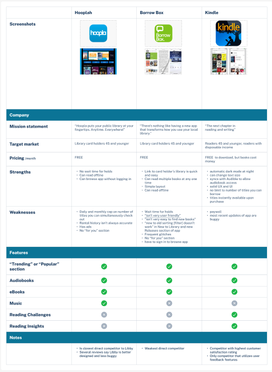
COMPETITOR RESEARCH
Following preliminary interviews, I researched Libby’s biggest three competitors: Hooplah, Borrow Box, and Kindle. Like Libby, Borrow Box and Hooplah allow users to check out content from their library using their library card. Kindle occasionally has free reads, but is a for-profit subsidiary of Amazon where users can buy online content to view on their device. I selected these competitors based off of functional relevance as well as popularity.
INTERVIEWS:
5/5 users would highly recommend Libby.
5/5 users highly prefer word of mouth for their content recommendations.
4/5 users only use Libby if they already know what title they want to read/listen to.
4/5 users need more than 2 weeks for their holds.
3/5 users use Libby for written content.
3/5 users mention social media as an influence on their reading habits.
3/5 users are satisfied with the amount they currently read.
2/5 users use Libby for audiobooks.
2/5 users use Libby as a social media replacement/deterrent.
0/5 users discover new content based off of Libby’s suggestions.
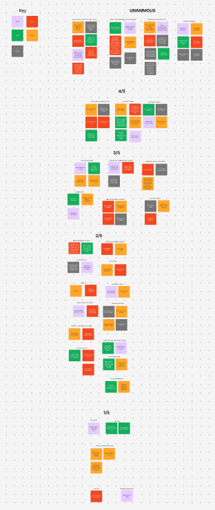
I conducted phone interviews with five Libby users.
WHO DID WE TALK TO?
WHAT DID WE LEARN?
These common threads are illustrated in the affinity map I compiled post-interviews:
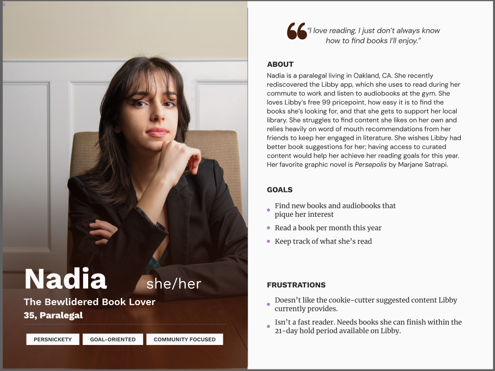
PERSONA
I used the insights distilled from affinity mapping to create our target user archetype: Nadia. She encompassed all the concerns and desires associated with our target audience, and provided a guiding light to refer back to throughout the design process.
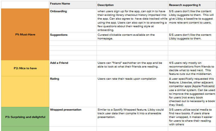
FEATURE ROADMAP
Now that I’d synthesized enough data to get a sense of user’s main pain points and goals, it was time to put together a feature roadmap. While I ended up still piroritizing an onboarding/suggestions feature as the “Must-Have” focus of this project, I was particularly excited about the possibilities associated with what I determined to be “Nice to Have” and “Surprise and Delight” features.
In doing my research, I realized that users largely view reading as social activity. The vast majority recieve book and content recommendations exclusively from word of mouth. Features such as Spotify’s “Wrapped” have become so beloved by users that they take on a life of their own outside of the app. Imagine if there was a literary equivalent. Users posting their yearly Libby Wrapped to their Instagram stories, getting curious about their friends’ top picks and feeling a sense of accomplishment from having a visual representation of their reading history. This sort of social-media inspired functionality could skyrocket Libby’s popularity even further than it already is.
The same logic applies to “Add A Friend” and “Rate” features, which are commonplace on most apps, especially those adjacent to Libby (I’m thinking Goodreads and StoryGraph). Many Libby users already use these apps. Why not cut out the middle man for our users by including these features all in one place, rather than across several apps?
In the end, I prioritized the onboarding/suggested content feature because it is essential to give users a strong foundational experience before adding more complex features. Allowing users to customize their content suggestions starts Libby down a path that these above mentioned “Nice to Have” and “Surprise and Delight” features could later accentuate.
Libby’s current recommendation system doesn’t increase the amount of content users consume on the app. What if we created a new system for recommending content to users in order to increase the amount each user reads?
THE VISION
People love Libby. It has upwards of three million five-star reviews on the app store, is the best and most widely used system for remotely accessing library content, and is used by more people than all its competitors combined. Adding a feature that directly addresses users’ biggest concerns will further establish its supremacy within its niche and increase its already massive usership.
THE BUSINESS
PRODUCTION
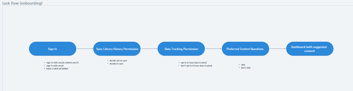
TASK FLOW
I created a task flow to get a high-level sense of the steps involved in the onboarding process. The bullets beneath each step in the task flow represent potential divergence points and additional screens I’d need to keep in mind when building my user flow.
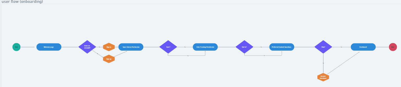
USER FLOW
I then created a user flow so I could understand which and how many screens I’d need to design in the wireframes to come.
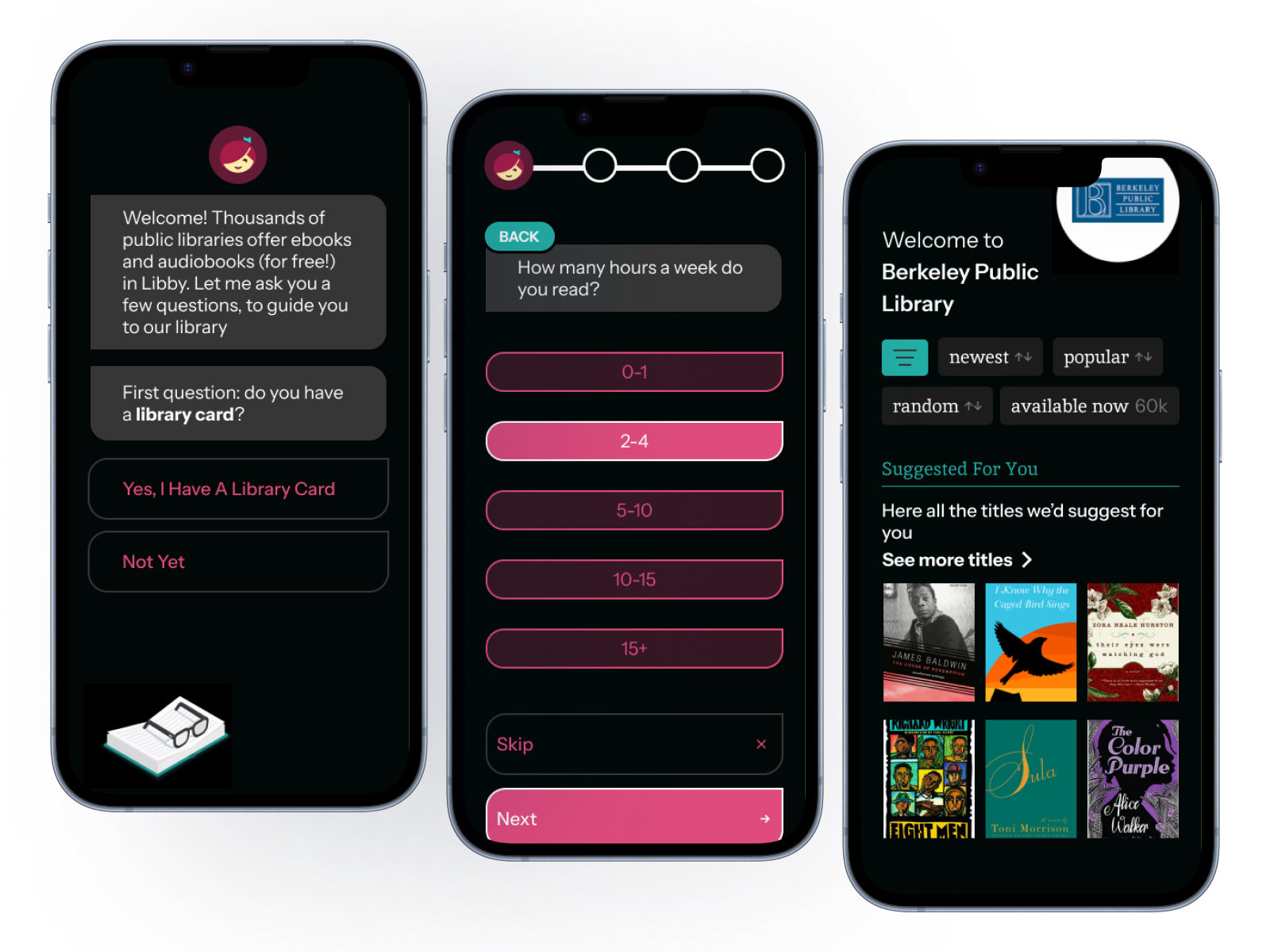
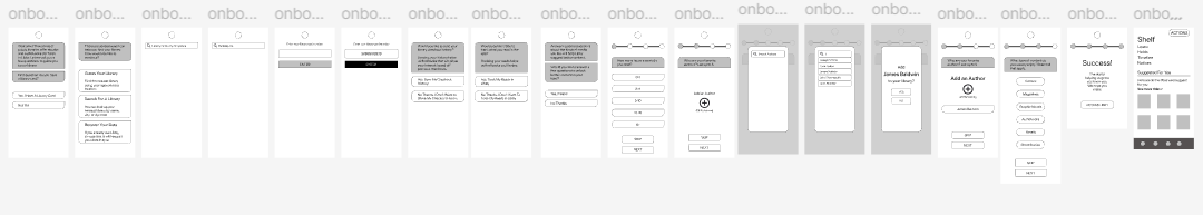
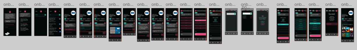
MOBILE WIREFRAMES
I used the steps outlined in my user flow to design my mid-fi wireframes. At this point in the design process, I would usually sketch out several ideas prior to mid-fi wireframing. However, because Libby’s existing UI already utilizes most of the elements I’d need to incorporate my onboarding feature, I was able to create mid-fi wireframes by rearranging these elements in a new context and populating them with relevant info for each screen.
UI DESIGN
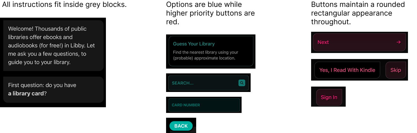
I utilized features within Libby’s existing UI to inform my design of the new feature. I paid close attention to active and inactive button states, as well as Libby’s use of shape and color to indicate meaning. I noticed patterns and kept them in mind throughout my design:
HI-FI USABILITY TESTING
I conducted usability tests with five participants. Three out of five participants were familiar with Libby, while the remaining two were not. I selected users with varying degrees of famliarity with Libby so that I could understand how the onboarding would affect returning users as well as new ones. I wanted to make sure I was desinging an intuitive, easily accessible app that didn’t require app-specific prior knowledge to navigate.
My design succeeded on this front, as users of all experience levels were able to complete the flow quickly and without incident.
The finished feature was sleek, intuitive, and engaged users exactly the way we’d hoped. Users were excited to see the content suggestions revealed to them at the end of their onboarding process, and genuinely delighted by the thoughtfulness of the questions asked of them throughout.
All users who have previously used Libby requested to have my onboarding feature added to the app for consumer use!
LEARNING, REFLECTION, AND GROWTH
This project was a fun exercise in attention to detail. I learned how to extrapolate patterns across Libby’s existing component set in order to create a new and exciting feature. Being forced to reverse engineer Libby’s existing UI improved my design skills tremendously; because I had a model to work off of, I was able to spend more time on building my components and less time fretting over how to make them accessible.
In completing this project, I came to realize that I vastly prefer improving existing systems to creating new ones from scratch. I also discovered that reverse-engineering existing components is the most helpful way for me to learn how to build more efficiently and to create more usable design systems.
NEXT STEPS
It is a dream of mine to work with the Libby team to develop this onboarding feature for consumer use. My design merges seamlessly with Libby’s existing UI, and has the potential to generate the increased usership Libby needs to continue growing in the modern age. My research indicates that we can use customized content to increase the amount of time users spend on the app and maximize user retention.