

Grand Lake Theater
ROLE
Product Design
DURATION
January 2025 – April 2025
Oakland moviegoers love Grand Lake Theater. The cinema is beautifully decorated, the prices are cheap, and the staff are friendly.
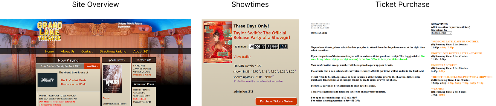
And yet, users don’t buy their movie tickets through the Grand Lake Theater website. One look at the landing page tells us why: the ticket purchase process is confusing, and the site itself is aesthetically unappealing.
As someone who loves going to Grand Lake, I couldn’t let this stand.
OVERVIEW
THE PROBLEM
People don’t use the Grand Lake Theater website.
MY HYPOTHESIS
Users don’t utilize the Grand Lake Theater website because the purpose of the site is unclear.
RESEARCH
GOAL: Find out how to make the Grand Lake Theater website more user friendly.
My initial experience with the Grand Lake Theater website informed my hypothesis. Prior to recruiting research participants, I went to the site and found it lacked clarity and cohesion: incongruous layout, color-coded superscripts, and a generally unappealing design made navigating the site unpleasant. The most confounding problem area was in ticket purchase; buying a ticket took too long, was disjointed, and counter-intuitive to navigate. This led me to question the purpose behind the site. Was it mostly intended to let viewers know what movies were playing and when? Was it created just because the owners thought it important to have a site up?
MY REASONING
OBJECTIVES: Determine
why people don’t use the existing Grand Lake Theater website
what users would like to be able to use the Grand Lake Theater website for
what existing features of successful movie theater websites can be utilized for the Grand Lake Theater site.
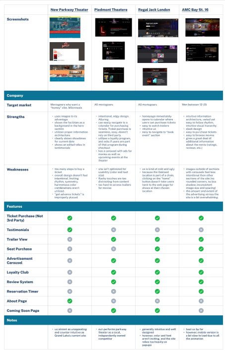
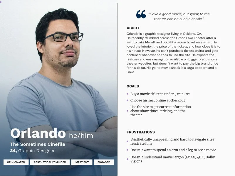
Following preliminary interviews, I researched Grand Lake Theater’s four biggest competitors: New Parkway Theater, Piedmont Theater, Regal Jack London, and AMC Bay Street 16.
It became clear that the websites for Grand Lake’s local competitors weren’t much better than Grand Lake’s itself. If we were going to level up Grand Lake Theater’s website, we’d have to take a leaf out of AMC’s book; their site was the most user-friendly and aesthetically pleasing, as well as the quickest to purchase tickets from.
COMPETITOR RESEARCH:
INTERVIEWS:
I conducted phone interviews with five Oakland moviegoers. I conducted phone interviews with five participants. Three interviewees were local and had gone to Grand Lake Theater before. The remaining two were moviegoers in other cities who had not visited Grand Lake Theater. I interviewed the locals in order to get a sense of returning users’ needs. The two remaining non-local participants served as necessary outliers. Because Oakland is a satelite city of San Francisco, it has a reasonably large tourist industry. These tourists likely comprise a significant number of Grand Lake’s clientelle. For this reason, I wanted to ensure that non-natives would be able to easily use the Grand Lake website as well as those already familiar with the theater.
Keeping in mind my hypothesis and also wanting to establish success metrics early on, I used the first part of each nterview as an opportunity to discover what users expect of a movie theater website. I then pivoted in the second half of the interview to assess users’ response to the existing Grand Lake Theater site. This second half of interviewing was essential to confirming or disproving my hypothesis, and would guide my later design decisions.
WHO DID WE TALK TO?
5/5 participants gave the Grand Lake Theater site a lower score than other movie theater sites they’d used lately.
5/5 participants had overwhelmingly negative reviews of the site.
5/5 participants expect to complete the checkout process in 3-5 minutes, and would quit using the site if it took longer than this time to purchase a ticket.
4/5 participants had never used the Grand Lake Theater website before.
4/5 participants mentioned expecting movie theater online checkouts in general to have an unnecessary level of difficulty.
2/5 participants explicitly mentioned Grand Lake’s checkout process being the worst they’d ever experienced with any product.
WHAT DID WE LEARN?
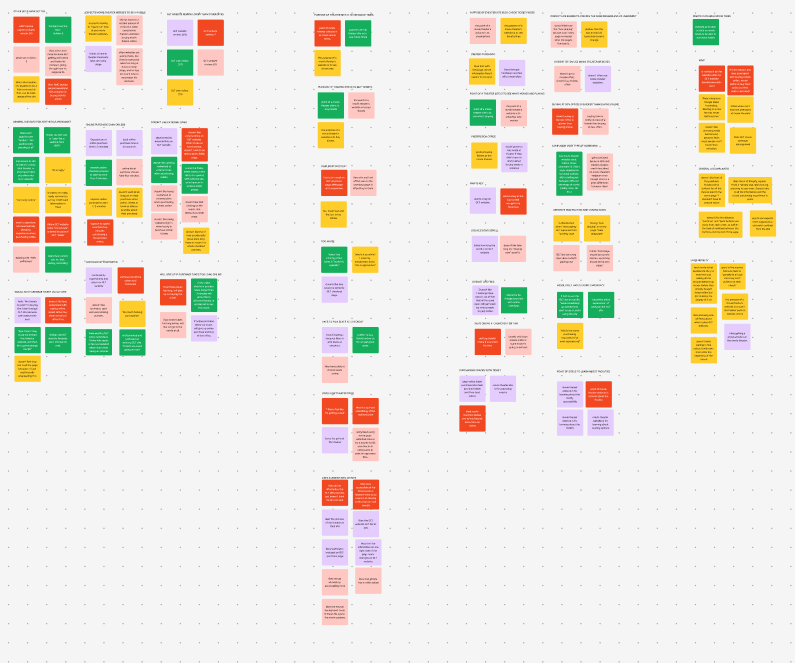
These common threads are illustrated in the affinity map I compiled post-interviews:
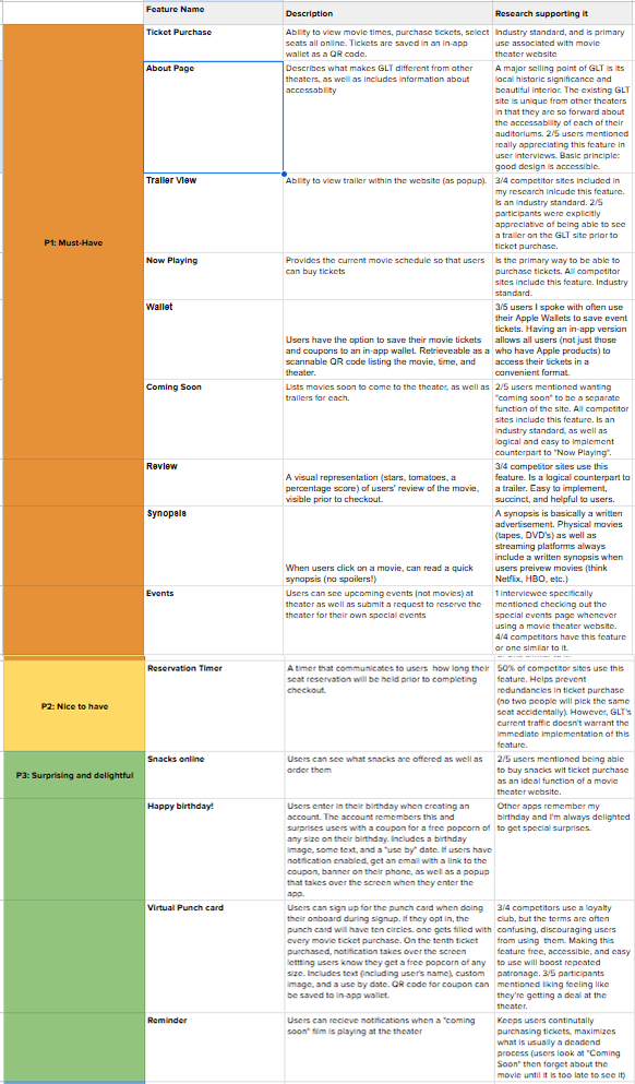
Having researched both user expectations and industry standards, I was able to get a sense of which features would best suit an MVP version of the Grand Lake Theater site and prioritize designing the most necessary features. Features associated with ticket purchase as well as access to movie and theater information were essential. Users expect to be able to find a theater, research a movie, and purchase tickets through a movie theater’s website before any other functions.
FEATURE ROADMAP
PERSONA:
I used the insights distilled from affinity mapping to create our target user archetype: Orlando. He encompassed all the concerns and desires associated with our target audience, and provided a guiding light to refer back to throughout the design process.
THE VISION
The path forward became clear: we needed to design a simple site that made ticket purchase quick, easy, and painless for users.
THE BUSINESS
Grand Lake Theater needs a website that boosts sales, rather than threatens them.
On Grand Lake Theater’s current site, advertising for current films is almost nonexistent and decreases ticket sales.
Likewise, the beauty and historic relevance of the theater itself isn’t demonstrated in the site experience. People come to Grand Lake Theater largely because of its beautiful interior. Not showcasing one of its largest points of sale on the site squanders the potential to increase ticket sales.
The site is so poorly designed that most people buy their tickets through a third-party, further reducing Grand Lake’s profits.
PRODUCTION
DESKTOP WIREFRAMES
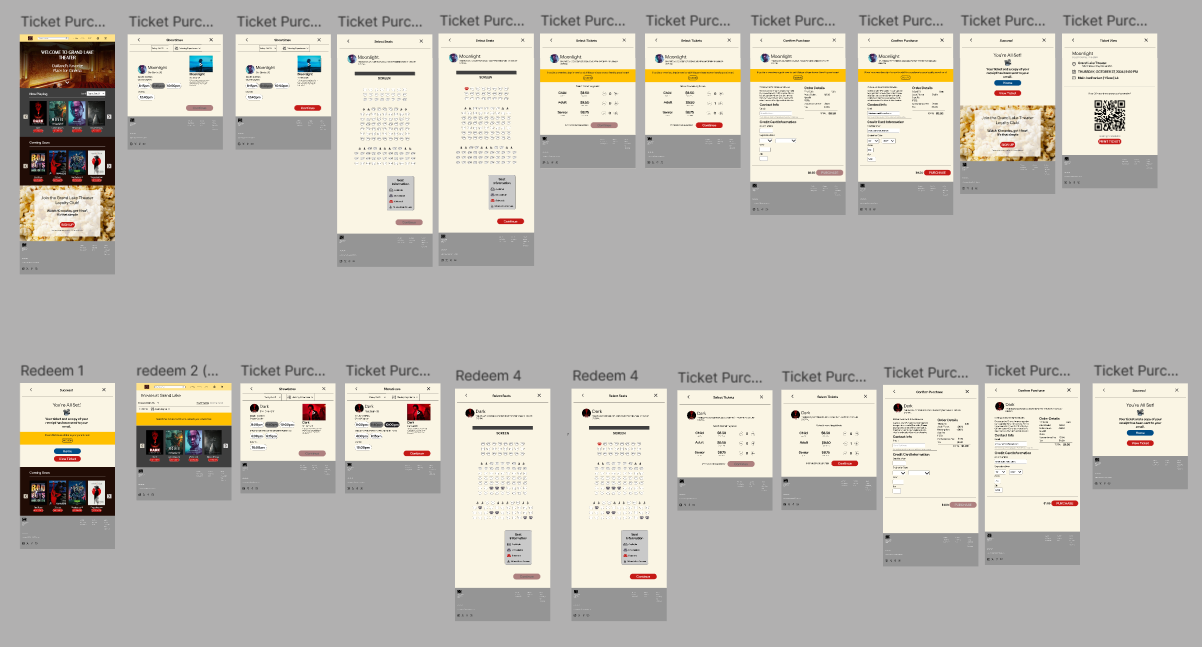
I designed two flows to be tested on desktop:
FLOW 1, Ticket Purchase: users purchase movie tickets as guests.
FLOW 2, Redeem Rewards: a returning user redeems their rewards to purchase a movie ticket.
I brainstormed ideas through rough sketches, then translated the best iteration of my ideas to Mid-Fi wireframes. Examples of choice screens are included below.

I conducted usability testing on my mid-fi wireframes and received helpful insights on my design.
All participants were able to complete both flows in less than the target time of 5 minutes.
All participants found both flows to be “intuitive”, “professional”, “quick” and/or “straightforward”, despite small design flaws.
3/5 participants wanted the “Now Playing” heading to look more clickable (i.e. make it a button or a hyperlink)
3/5 participants want the pricing for the Redeem flow to reflect that they won’t be charged.
MID-FI USABILITY TESTING

HI-FI USABILITY TESTING
I took the insights from my mid-fi testing and applied them to my hi fi model. The resulting Hi-Fi prototype met or exceeded the following success metrics:
● All users rated their experience a 8.5 or above.
● All users successfully bought movie tickets in 3 minutes or less.
● All users redeemed their punch card rewards in 3 minutes or less.
In terms of layout, I took a lot of inspiration from the AMC Bay St. 16 website. I appreciated how easy it was to purchase a ticket and find additional information on the films showing. I created a simplified version of the content carousel on their homepage, used their layout as a guide for organizing Grand Lake Theater’s showtimes and checkout page, as well as improved upon their not-so-user-friendly seat selection screen.
UI DESIGN
During hi-fi user testing, several users seemed confused that the instructions required them to navigate to the “Now Playing” page even though the movie they wanted to see was already listed prominently on the homepage. Realizing I’d inadvertently increased cognitive load on my users, I edited the user testing instructions and prototype to allow users to select the movie they wanted to see directly from the home screen.
PROTOTYPE ITERATION
Grand Lake’s updated website design was simple, beautifully designed, and intuitive to users. My design made the purpose of the website clear: a digital box office. Incorporating proper information hierarchy and implementing proper design principles allowed me to transform Grand Lake Theater’s online presence from shabby to stellar.
I really enjoyed this project because of how easy I found it to empathize with my users. I regularly watch films at Grand Lake Theater, and love that I was able to solve a problem that directly affects me and my community.
If I had the opportunity to re-do this project, I would adjust its scale so it doesn’t feel too “zoomed in”. Older users appreciated the accessibility of larger text, but one of my younger viewers found it too zoomed in. I’d like to see if there is a happier medium than the one I initially designed.
Likewise, I’d appreciate a higher-quality image for the hero section. I chose the highest quality photo I could find at the time, but the pixelation was still greater than I’d like.
LEARNING REFLECTION AND GROWTH
NEXT STEPS
I intend to pitch this design to Grand Lake Theater for development and commercial use. My design draws from the ambience of the Theater’s actual interior and combines it with the solid design principles used by other leading online box offices. This design has the potential to easily double Grand Lake Theater’s sales, and to bring this historic establishment into the modern age.